Designing for Retrieval

Designing for Retrieval

As TextNow customers accumulated years of conversations and shared content, finding something from the past became increasingly difficult. I led product design for a new conversation search experience, working cross functionally to understand retrieval needs, prioritize the right problems, and create a modular architecture. The result was a clearer, scalable search experience that helped customers find what they were looking for and reconnect with context.

As years of conversations and content accumulated, TextNow customers struggled to find older information. I led product design for a new search experience, working cross functionally to define retrieval needs, prioritize the right problems, and create a modular architecture. The result was a clearer, scalable experience that helped customers find what they needed and reconnect with context.

ROLE

Product Design Lead

PARTNERS

Product, Research, Engineering

READ TIME

8 min

01. Problem Space

Over time, customers accumulated years of conversations and shared content within TextNow. The existing search experience hadn’t evolved alongside that growth, making older information increasingly difficult to retrieve. The original search experience was minimal and unstructured. As messaging became a larger part of the product experience, the limitations of search became increasingly visible. Customers were storing years of conversations, but the retrieval experience hadn’t evolved alongside the growth of that content.

The existing search surfaced a large list of keyword matches pulled from conversations, with little organization or support for different types of content. As a result, users often lost context after tapping into results and struggled to quickly find what they were looking for.

02. Research

Customer feedback consistently highlighted the same problem: people struggled to find older conversations and information. Research showed users weren’t just searching for messages, they were trying to reconnect with the surrounding conversation and context. This reframed the challenge from simply finding content to helping users quickly understand and navigate to the right information.

Customer feedback showed search was frustrating, but our research also showed it was heavily used. Around 25% of customers searched daily, and 1 in 3 searched weekly, making search one of the product’s core workflows. This wasn’t a niche feature. Customers already relied on it to reconnect with conversations and information. That combination of high usage and consistent customer feedback made improving search a clear product priority.

Customer feedback consistently highlighted the same problem: people struggled to find older conversations and information. Research showed users weren’t just searching for messages, they were trying to reconnect with the surrounding conversation and context. This reframed the challenge from simply finding content to helping users quickly understand and navigate to the right information.


Customer feedback showed search was frustrating, but our research also showed it was heavily used. Around 25% of customers searched daily, and 1 in 3 searched weekly, making search one of the product’s core workflows. This wasn’t a niche feature. Customers already relied on it to reconnect with conversations and information. That combination of high usage and consistent customer feedback made improving search a clear product priority.

03. Challenge

This led to a core design challenge. The experience needed to help customers quickly retrieve content while preserving the context around it. Finding information was only part of the problem. Users also needed to understand where that information lived within the conversation. At the same time, the solution needed to remain organized and scalable as additional content types were introduced over time.

04. Strategy

Rather than trying to support every content type in the initial release, I worked with product and engineering to identify the smallest set of improvements that would deliver meaningful customer value first. We established a foundation focused on chats, messages, contacts, and contextual navigation. Once that foundation was set, we could expand to additional content types such as links, photos, videos, and GIFs. This phased strategy allowed us to improve the experience immediately while creating a scalable framework that could continue evolving.

05. Early Exploration

During early exploration, we considered presenting every result in a single continuous feed. While straightforward to implement, that approach became increasingly difficult to scan as additional content types were introduced. We also explored filter-based refinement, but I felt it was more important to first establish a strong retrieval foundation before adding ways to narrow results.

The larger insight was that chats, messages, contacts, links, and media each served different user goals and carried different levels of context. Rather than forcing everything into a single structure, I proposed a modular architecture where each content type could be optimized for how customers naturally retrieved it.

06. Modular Architecture

I designed a modular retrieval system organized around how customers searched for different types of content. Each section was tailored to its own retrieval behavior while still feeling like part of one cohesive search experience. Surfacing only the most relevant results from each category kept search lightweight and allowed customers to quickly drill deeper when needed.

Chats

For chats, recognition was more important than reading. Customers often remembered who they spoke with before recalling specific keywords or message content. I designed chat results to prioritize participant imagery and names, allowing conversations to be identified through visual recognition first. Secondary information was intentionally de-emphasized so the most recognizable elements could be scanned as quickly as possible.

Chats search results interface

Messages

Message results required a different retrieval strategy. Customers were usually searching for a specific piece of information within an ongoing conversation, not simply the conversation itself. I highlighted the matching content while preserving surrounding context, participant information, and timestamps so customers could quickly understand why a result was relevant before opening the thread. The emphasis was carefully balanced so the matching term stood out without losing the surrounding context that made it meaningful.
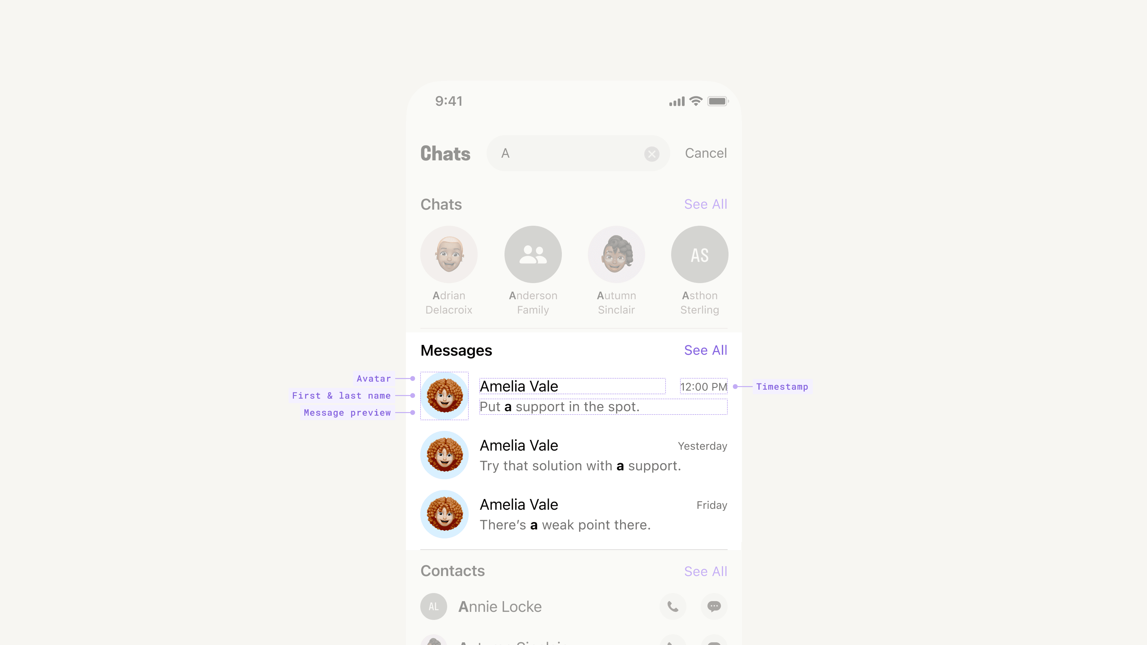
Messages search results interface

Contacts

Contact retrieval was fundamentally different from chats and messages. In many cases, customers weren’t looking to browse information. They wanted to quickly call, message, or view a profile. Rather than treating contacts like another search result, I surfaced communication actions directly within the results. This allowed customers to complete common tasks immediately without leaving the search experience.

Contacts search results interface

07. Scalability

Scalability was another key consideration. The system needed to work whether a section contained one result or hundreds. Rather than presenting an endless list, each category surfaced the most relevant results first before gracefully transitioning to a dedicated results view through See All. This kept search focused and easy to scan while ensuring the architecture could scale as customers accumulated more content over time.

Selecting “See All” opened a dedicated results view for that specific content type. This allowed customers to browse larger result sets without overwhelming the primary search experience. Separating overview from exploration kept the initial experience fast while still supporting deeper retrieval when needed.

08. Context Retrieval

Selecting a message took customers directly to the relevant point in the conversation with the matching result highlighted. Finding the message was only the first step. Customers also needed enough surrounding context to understand why it was relevant. Returning them directly to that moment in the conversation allowed them to quickly regain context, review what came before and after, and continue their task.

Selecting a message took customers directly to the relevant point in the conversation with the matching result highlighted. Finding the message was only the first step. Customers also needed enough surrounding context to understand why it was relevant. Returning them directly to that moment in the conversation allowed them to quickly regain context, review what came before and after, and continue their task.

09. Expansion

To help engineering plan ahead, I designed both the Foundation and Expansion phases together so there was a clear vision for how search could evolve over time.

To help engineering plan ahead, I designed both the Foundation and Expansion phases together so there was a clear vision for how search could evolve over time.

Chats search results interface

Media

Media introduced a different challenge. Unlike messages or links, we couldn't reliably index the contents of images, videos, or GIFs without image recognition infrastructure. Rather than excluding media until that capability existed, I explored an alternative retrieval model that still delivered customer value. Instead of treating media as a traditional search result, I proposed surfacing recently shared media before a search was performed, allowing customers to browse visually rather than relying on keywords. Large thumbnails became the primary recognition cue, while sender avatars preserved conversation context. It wasn't a complete media search solution, but it delivered immediate value while preserving a path toward richer media retrieval in the future.

Media introduced a different challenge. Unlike messages or links, we couldn’t reliably index the contents of images, videos, or GIFs without image recognition infrastructure. Rather than excluding media until that capability existed, I explored an alternative retrieval model that still delivered customer value. Instead of treating media as a traditional search result, I proposed surfacing recently shared media before a search was performed, allowing customers to browse visually rather than relying on keywords. Large thumbnails became the primary recognition cue, while sender avatars preserved conversation context. It wasn’t a complete media search solution, but it delivered immediate value while preserving a path toward richer media retrieval in the future.

Messages search results interface

10. Results

Once the experience launched, we measured success through an A/B test against the existing search experience. We focused on three key signals: whether users were finding what they were looking for through retrieval, whether they were leaving search without success through abandonment, and whether the overall experience felt better through satisfaction. Together, these metrics gave us a balanced view of both task completion and the overall customer experience.

The redesign increased NPS by 0.14 points, while search success and abandonment remained stable. We also spoke directly with customers after launch, and the qualitative feedback consistently described the experience as clearer, faster, and easier to navigate. Together, these results showed that customers were finding information with less friction and greater confidence. Because we improved customer perception without negatively impacting retrieval metrics, the redesign was rolled out to all users.

11. Takeaway

One of the biggest lessons from this project was that search isn’t just about retrieving information. It’s about helping users quickly regain context. Early in the project, we thought we were solving a search problem. Through customer conversations and design exploration, it became clear that people weren’t simply trying to find messages. They were trying to reconnect with conversations, decisions, and moments from the past.

That insight helped shape design decisions, from organizing results by content type to returning users directly to the matching point within a conversation. Looking back, the project’s success came from identifying the smallest set of improvements that could deliver immediate customer value while establishing a foundation the experience could continue to grow from.